Code
import numpy as np
import matplotlib.pyplot as plt

r = np.arange(0, 2, 0.01)
theta = 2 * np.pi * r
fig, ax = plt.subplots(
  subplot_kw = {'projection': 'polar'}
)
ax.plot(theta, r)
ax.set_rticks([0.5, 1, 1.5, 2])
ax.grid(True)
plt.show()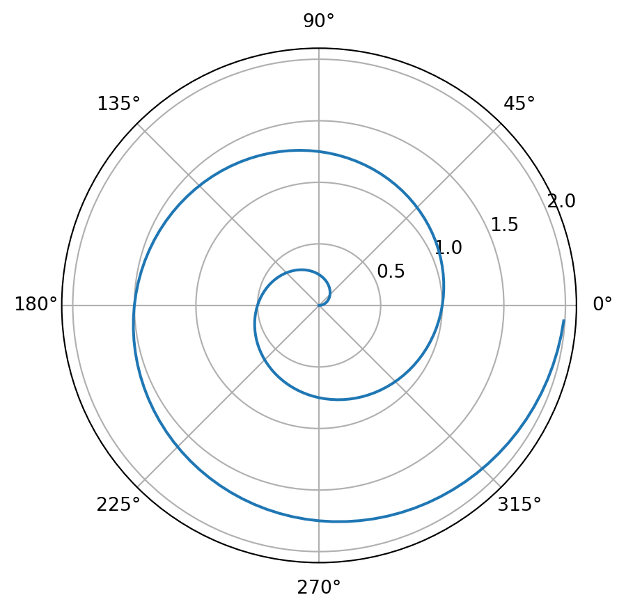
For a demonstration of a line plot on a polar axis, see Figure 1.
import numpy as np
import matplotlib.pyplot as plt
r = np.arange(0, 2, 0.01)
theta = 2 * np.pi * r
fig, ax = plt.subplots(
subplot_kw = {'projection': 'polar'}
)
ax.plot(theta, r)
ax.set_rticks([0.5, 1, 1.5, 2])
ax.grid(True)
plt.show()bertin.js
Manhamady OUEDRAOGO (Burkina Faso) & Nicolas LAMBERT (France) https://ee-cist.github.io/CAR2_cartodyn/TP2/docs/index.html
viewof year =  Inputs.range(
  [1990, 2019],
  {value: 2019, step: 1, label: "Année"}
)
viewof k =  Inputs.range(
  [20, 100],
  {value: 50, step: 1, label: "Rayon max"}
)
meta = FileAttachment("data/worldbank_meta.csv").csv()
viewof indicator = Inputs.select(
  new Map(meta.map((d) => [d.indicator, d.shortcode])),
  { label: "Indicateur" }
)
projections = ["Patterson", "NaturalEarth1", "Bertin1953", "InterruptedSinusoidal", "Armadillo", "Baker", "Gingery", "Berghaus", "Loximuthal", "Healpix", "InterruptedMollweideHemispheres", "Miller", "Aitoff", "ConicEqualArea", "Eckert3", "Hill"]
viewof proj = Inputs.select(projections, {label: "Projection", width: 350})
viewof color = Inputs.color({label: "couleur", value: "#4682b4"})
viewof simpl =  Inputs.range( [0.01, 0.5], {value: 0.1, step: 0.01, label: "Simplification"} )
viewof x =  Inputs.range( [-180, 180], {value: 0, step: 1, label: "Rotation (x)"} )
viewof y = Inputs.range( [-90, 90], {value: 0, step: 1, label: "Rotation (y)"} )bertin.draw({
params: {projection: proj + `.rotate([${x}, ${y}])`, clip: true },
layers:[
{ type : "header", text: title},
{type: "bubble", geojson: data, values: indicator,
fill: color, fixmax: varmax, k,
tooltip: ["$name",d => d.properties[indicator]]},
{geojson: world2, fill: "#CCC"},
{type: "graticule"},
{type: "outline"}
]})Inputs.table(statsyear, { columns: [
"country",
"capital_city",
"region",
indicator
]})viewof topnb = Inputs.range([5, 30], {label: "Nombre de pays représentés", step: 1})
top = statsyear.sort((a, b) => d3.descending(+a[indicator], +b[indicator]))
.slice(0, topnb)
Plot.plot({
marginLeft: 60,
grid: true,
x: {
//type: "log",
label: "Années →"
},
y: {
label: "↑ Population",
//type: "log",
},
marks: [
Plot.barY(top, {
x: "iso3c",
y: indicator,
sort: { x: "y", reverse: true },
fill: color
}),
Plot.ruleY([0])
]
})world = FileAttachment("data/world.json").json()
stats = FileAttachment("data/worldbank_data.csv").csv()
geo = require("geotoolbox@latest")
world2 = geo.simplify(world, {k: simpl})
bertin = require("bertin@latest")
statsyear = stats.filter(d => d.date == year)
data = bertin.merge(world2, "id", statsyear, "iso3c")
varmax = d3.max(stats.filter(d => d.date == 2019), d => +d[indicator])
title = meta.map((d) => [d.indicator, d.shortcode]).find((d) => d[1] == indicator)[0] + " in " + yearD3.js
chart = {
  const k = width / 120;
  const r = d3.randomUniform(k, k * 4);
  const n = 4;
  const data = Array.from({length: 100}, (_, i) => ({r: r(), group: i && (i % n + 1)}));
  const height = width / 2;
  const color = d3.scaleOrdinal(d3.schemeTableau10);
  const context = DOM.context2d(width, height);
  const nodes = data.map(Object.create);

  const simulation = d3.forceSimulation(nodes)
    .alphaTarget(0.3)
    .velocityDecay(0.1)
    .force("x", d3.forceX().strength(0.01))
    .force("y", d3.forceY().strength(0.01))
    .force("collide", d3.forceCollide().radius(d => d.r + 1).iterations(3))
    .force("charge", d3.forceManyBody().strength((d, i) => i ? 0 : -width * 2 / 3))
    .on("tick", ticked);

  d3.select(context.canvas)
    .on("touchmove", event => event.preventDefault())
    .on("pointermove", pointermoved);

  invalidation.then(() => simulation.stop());

  function pointermoved(event) {
    const [x, y] = d3.pointer(event);
    nodes[0].fx = x - width / 2;
    nodes[0].fy = y - height / 2;
  }

  function ticked() {
    context.clearRect(0, 0, width, height);
    context.save();
    context.translate(width / 2, height / 2);
    for (let i = 1; i < nodes.length; ++i) {
      const d = nodes[i];
      context.beginPath();
      context.moveTo(d.x + d.r, d.y);
      context.arc(d.x, d.y, d.r, 0, 2 * Math.PI);
      context.fillStyle = color(d.group);
      context.fill();
    }
    context.restore();
  }

  return context.canvas;
}